As Featured on Inc.com
HOW TO
Will your expensive new redesign succeed? Avoid these 6 common pitfalls.
Skipping the reality check.
If you make your assumptions in a bubble, don’t be surprised when you eventually hear a loud popping sound. Yes, most design agencies understand the importance of starting with a discovery (i.e. talking about your audience and their goals). But drawing a persona on a white board isn’t enough. To truly crystallize the needs and hesitations of all your target markets, leave the closed room, go outside and actually talk to them. Put yourself in the consumer’s environment and watch in real-time as they make decisions about your company. Are your assumptions correct? What does a typical client really want? What fears are holding them back? It’s also critical to pay close attention to the words your customers are using to describe the issues. If you say hemoptysis, but they say coughing up blood, there’s going to be a painful disconnect.

-
Overlooking the psychology of decision-making.
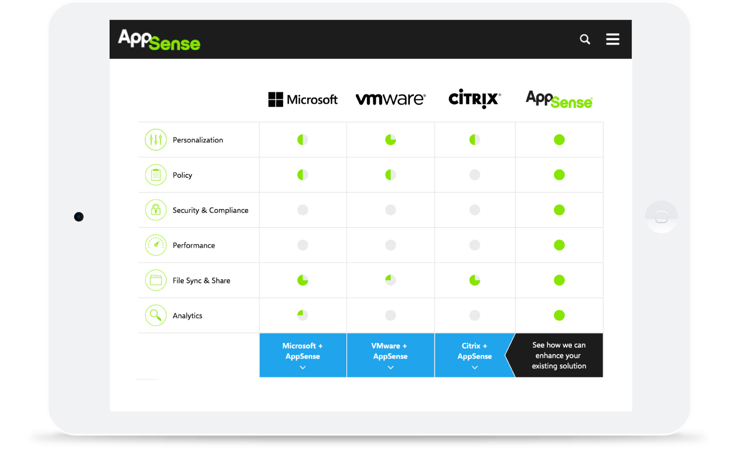
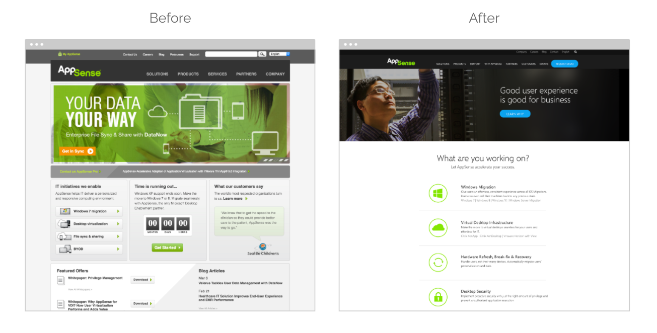
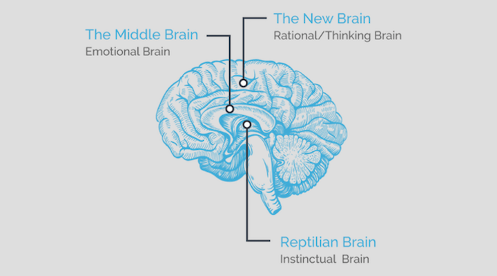
You can’t afford to assume that people will take one look at a sturdy set of facts and do what’s best for them. If that were true, we’d all have hefty retirement accounts, get enough sleep and have long ago shed those last five pounds. The fact is, we’re all irrational creatures. Luckily, emerging research in behavioral economics and social psychology shows that there’s a predictable pattern to our wacky behaviors. At Next Step, we use these predictable patterns to remove friction from the decision-making process at every single stage. For example, a global software company was having trouble getting traction with its old site- too much information and too many messages resulted in too much cognitive overload, which resulted in prospects bouncing away from their site in droves. We simplified their core messaging and helped the user make meaningful comparisons between them and their direct competitors through relative choices. We even added a section called “Who Needs It,” addressing the specific friction points and benefits for each of their buyer personas. The results: Web inquiries increased by 600%, blog traffic increased by 400%, and bounce rate dropped by 40%.

Skimping on design.
Don’t chase the trend of the week, whether that’s a font or a color scheme. Yes, you need to be aware of best practice so that you deliver an experience that’s intuitive and expected. But colors, fonts and site architecture are deeply personal, powerful elements to a redesign. Design drives behavior. Have you placed the key messages in the areas where the human eye tends to land first? Have you made it easy for users to scan your services by marrying them with icons? Clients who put careful thought into winning customers’ confidence perform far better than those who simply dump all their information on a landing page.

Forgetting what it’s like to be new.
One of our clients wanted their site to reduce the costs associated with their call center. By asking a few questions, we realized that their users were older consumers who were not comfortable navigating a complex website. They would pick up the phone at the slightest hurdle. We knew their new site had to take this demographic into account and make it extra easy for users to find specific answers, fast. We replaced a complex site with one that laid out the users’ most common concerns in simple language directly on the home page. Icons made it easy to scan for categories and the answers were now just a click away. The result: the redesign reduced calls by 70%.

Adding too much info.
Over the years we’ve discovered that even the smartest, biggest and most worldly corporations suffer from the “and this” syndrome. They add fact after fact after benefit after feature. But too many messages = no message. If you inundate the consumer with too much information, they’ll bounce. Ironically, in order to distil your info, you’ll first need to wade knee high in it, from discovery to collateral, through multiple customer interviews and rounds of fine-tuning the site architecture. But ultimately, all that’s left is your company’s essence. There's no reason to do away with all your hard-earned data; just be strategic way about displaying it. Let consumers digest the essence of your message. They’ll then dig deeper into the site to justify the choice they’ve already made. This so-called “progressive disclosure” allows consumers to control their journey and feel good about their intuitive choices.

Relying on slow load times.
This is a message from Captain Obvious. Consumers won’t wait around for your site to load. If your site takes 3 seconds to load you risk 22% fewer page views, 50% higher bounce rate and 22% fewer conversions. Building speed into your site is not a one-time thing. Like all the other essentials, you need build it in from the ground up. Create clean, well-structured code that has fearlessly pruned all inactive lines from the files. Make sure that you’re working with a firm whose developers consistently minimize all files and always size your site’s images based on the design. If you use billboard-sized images for postage-sized usage, you’re wasting everybody’s time.
Avoiding these common pitfalls in a redesign can greatly boost your chance of success. Demand that each element of your new site creates an irresistible momentum and your redesign won’t fall short.
Maybe you’re launching a new product. Or maybe your outdated site is starting to turn away business. There are several good (and even urgent) reasons to overhaul your company’s site, design and messaging. But if you don’t avoid these common mistakes, that expensive new redesign could do more harm than good.


